
A Tour of Prosefly's Astro Components
A practical tour of every public component, rendered together in one real MDX article.
@prosefly/astro-components is the shared MDX layer used by Lotus and Dahlia. It exists because
technical articles regularly need more structure than Markdown provides, but that structure should
not tie the writing to one documentation theme.
This page renders every public component from version 0.7.1 inside Aster. It is both a tour and a portability test: Aster supplies its own layouts, typography, colors, and spacing while the package supplies content structure and focused interactions.
One integration
Aster registers proseflyComponents() once. The integration supplies shared
Markdown transforms, gallery assets, and Iconify preloading.
The examples stay inside one article on purpose. A component can look convincing in an isolated catalog and still feel too heavy when surrounded by real headings, paragraphs, and code. Seeing the whole set in sequence makes the intended hierarchy clearer.
Badges, icons, and callouts
Badges carry short metadata without interrupting a paragraph:
Astro 7 MDX Stable PrivateIcons can be decorative or carry an accessible title. This icon is decorative; this one announces its meaning.
Use the lightest component that explains the idea
A badge labels, an icon cues, and a callout interrupts. Choosing between them is part of writing the page.
Cards and steps
Lotus
A complete documentation shell with navigation, search, and configurable design tokens.
Dahlia
A minimal, content-first theme built on the same component layer.
-
Install the package.
pnpm add @prosefly/astro-componentsnpm install @prosefly/astro-componentsyarn add @prosefly/astro-componentsbun add @prosefly/astro-components -
Register the integration.
Add
proseflyComponents()toastro.config.mjs. -
Import components in MDX.
Keep ordinary prose in Markdown and reach for components only when structure helps.
Tabs and accordions
Tabs work well when several commands complete the same task.
pnpm add @prosefly/astro-componentsnpm install @prosefly/astro-componentsAccordions keep optional answers available without lengthening the main path.
Can the components work without Lotus or Dahlia?
Yes. Register the shared integration and map the semantic Prosefly CSS properties to the surrounding site’s design tokens.
Do Prosefly themes need extra setup?
No. Lotus and Dahlia already register the integration and expose the shared components to their MDX content.
File trees
FileTree turns a single Markdown list into an expandable project map.
Directory src
Directory content
Directory blog
- astro-components-tour.mdx
- projects
- content.config.ts
- pages
- astro.config.mjs
- package.json
Image galleries
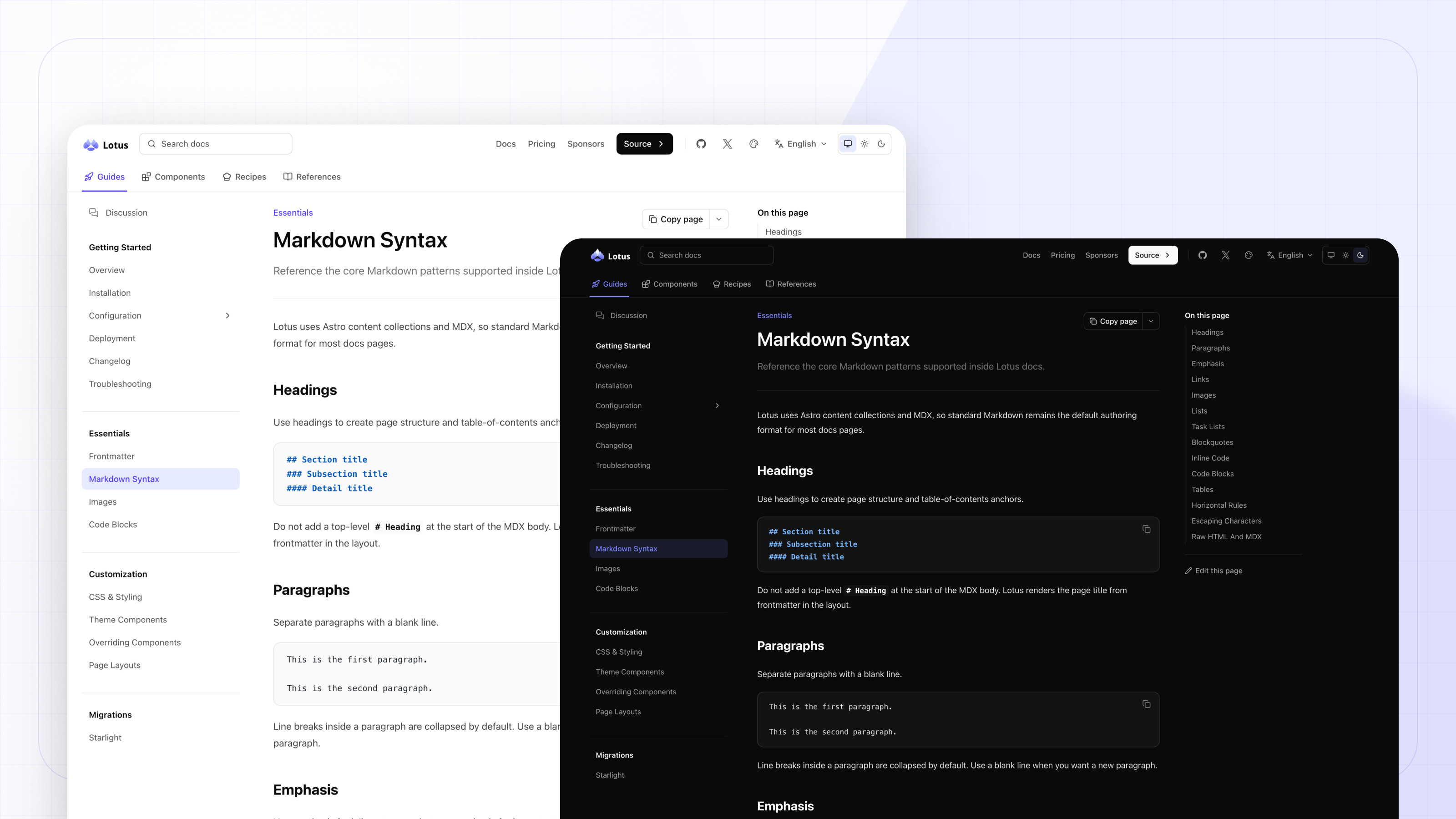
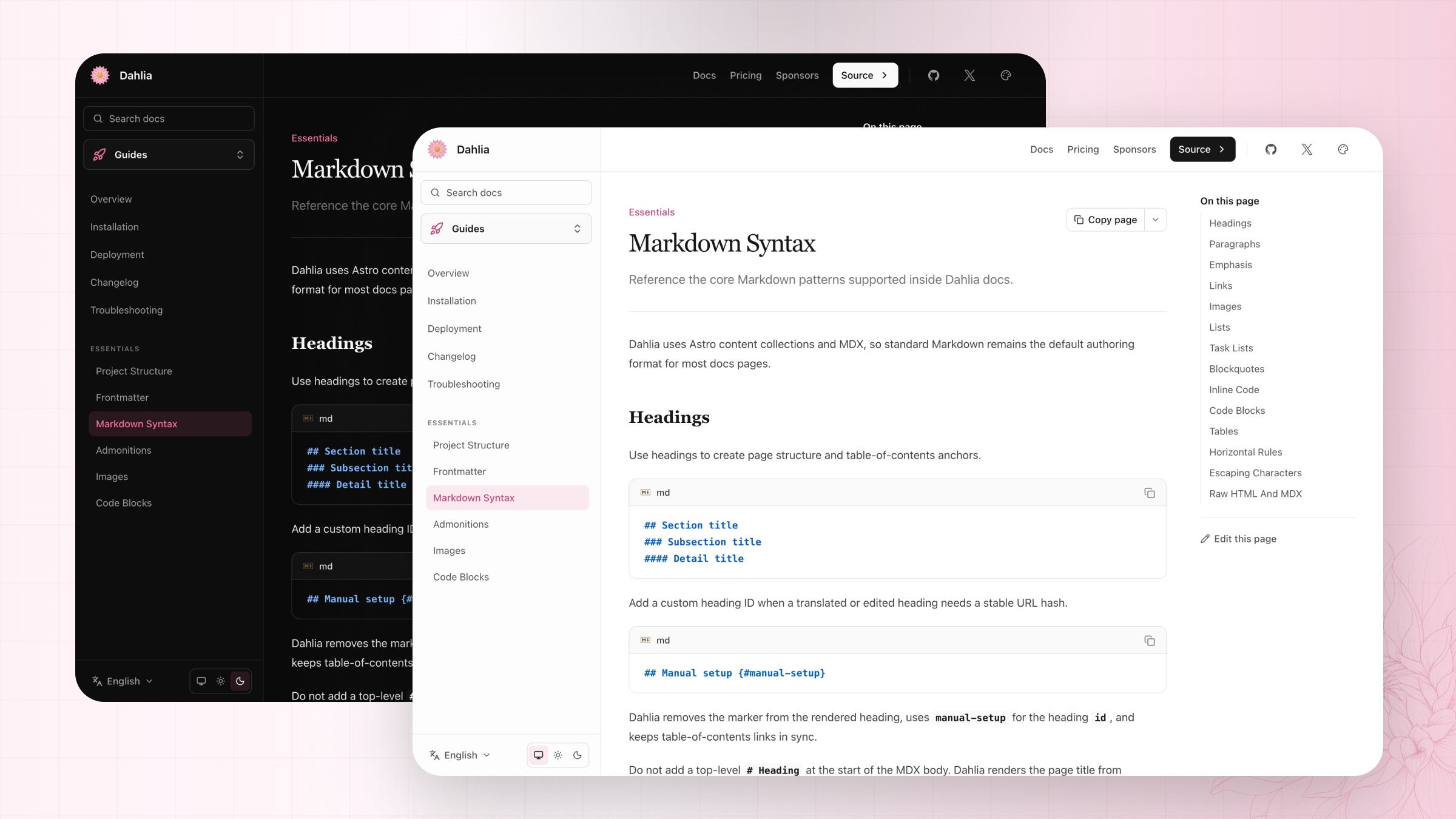
ImageGallery keeps related screenshots together and owns its responsive browser behavior.
Rich links and audio
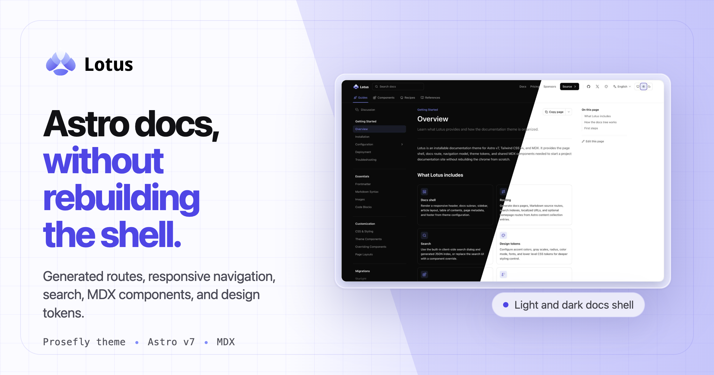
Supplying complete metadata lets Embed render a link card without fetching the destination
during the build.
AudioPlayer enhances the native audio element with metadata, seeking, playback speed, mute, and
Media Session support where the browser provides it.
Choosing the smallest useful component
The package is not meant to replace ordinary Markdown. Most sentences, lists, links, images, and code blocks should remain native content. A component earns its place when it adds a relationship or behavior that Markdown cannot express clearly.
Label
Use a badge for compact status or category metadata that belongs beside the prose.
Interrupt
Use a callout when a note, warning, or recommendation should change how the reader interprets the surrounding section.
Organize
Use cards, steps, tabs, accordions, or a file tree when the relationship between several pieces is the point.
Enhance media
Use a gallery, embed, or audio player when native media needs grouping, metadata, or focused controls.
That restraint keeps an MDX page readable in source form and makes the component API easier to maintain. The important boundary is unchanged across every example: components supply structure and behavior, while the host site supplies the visual system.